Banner
SILHOUETTE — *the impact pose. recognizable from outline alone. good character art reads at thumbnail.*
Listen along — Banner
Loading audio…
Press play to listen along. The line being read lights up as you go.
Show full transcript
Loading transcript…
Chapter 5 — Banner and the Outline That Tells the Story
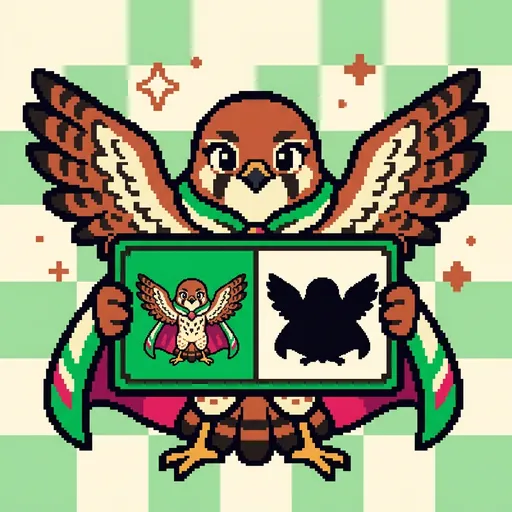
Banner tipped one wing and dropped out of the morning sky, and the kids on the workshop roof gasped before she even landed. She hadn’t shown her russet feathers yet. She hadn’t shown the dark tips or the chunky herald-cape. All they’d seen was her shape against the sun — a hovering, fork-tailed cutout, wings held in that steady kestrel float.
“You knew it was me,” she said, folding down onto the ledge. “From a black shape. From nothing but my outline.”
A small fox-kit named Ollie nodded, wide-eyed. “You looked like you. Even far away. Even tiny.”
Banner’s chest warmed. That, right there, was the whole thing. “That,” she said, tapping his nose with the edge of her wing, “is what I want to show you today.”
She had learned it high up, in a place called High-Tower Village, where her family had been the banner-bearers for longer than anyone could count. Every kestrel in her line stitched the same shape onto the village flags: wings spread wide, tail forked, that unmistakable hover.
Banner’s grandmother had explained it to her once, when Banner was small and impatient and wanted to add glittering thread and tiny embroidered flowers to a flag.
“Squint,” her grandmother had said.
Banner had squinted.
“Now — can you still tell it’s a kestrel?”
The flowers vanished into a fuzzy blur. The glitter meant nothing. But the wide-wing shape held. Even squinting, even from the far end of the tower, it read.
“The shape carries the whole thing,” her grandmother had said. “If the shape is strong, the flag is strong. The pretty parts come after — or not at all.”
Banner never forgot the moment the flowers disappeared and the kestrel stayed.
She walked down to PixelForge when she was thirteen, and her mentor Palette met her at the workshop gate holding two cards.
“Two heroes,” Palette said. She turned the first card so only its black cutout showed — an armored figure, sword raised, round shield forward. “Tell me who this is.”
“A knight,” Banner said instantly. “Sword up. Shield out. Ready to fight.”
Palette turned the second card. Its cutout was a lumpy, rounded blob. “And this one?”
Banner tilted her head. She tilted it the other way. ”…A potato?”
Palette laughed — a real, delighted laugh. “In full color he’s a lovely blue-tunic’d traveler. But in shadow he’s a potato, and a potato is nobody. You saw it in half a second.” She pressed the two cards into Banner’s claws. “You already understand. Come teach it.”
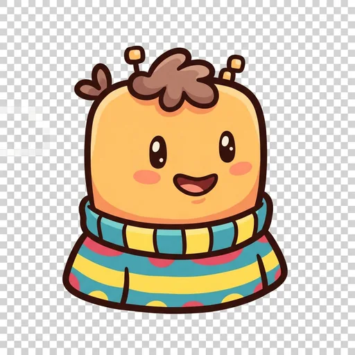
Now Banner had her own bright workshop, all drawing tablets and glowing screens, and Ollie the fox-kit had climbed down off the roof to watch her work.
“Here’s your traveler,” Banner said, sketching a friendly little fellow in a blue tunic. “Cute face. Nice colors.” She swept a finger across the screen and filled him solid black. The cute face vanished. What was left was a round, lumpy nothing. “Now squint.”
Ollie squinted. “It’s just… a blob.”
“A blob is a forgotten character,” Banner said gently. “Not because you drew him badly. Because his shape doesn’t say anything yet.” She picked up her stylus. “Watch — I’m not going to add detail. I’m going to change his silhouette.”
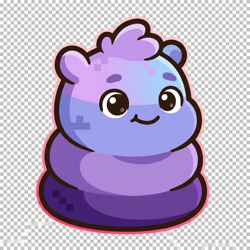
She drew a tall, pointed hat that stabbed up off his head. She flared a long coat out at the bottom so it swished. She hung an enormous round shield off one arm, big as a dinner plate.
Then she filled him black again.
“Now squint.”
Ollie squinted — and grinned. “A wizard! Pointy hat, big coat. And that huge shield-side. I can tell.”
“Same character,” Banner said. “Same size. I didn’t add one fancy color. I just gave him a shape that reads.” She set the stylus down. “That’s the order. Strong shape first. Colors second. Tiny details last — if there’s even room.”
Ollie was quiet a moment, running his paw along the edge of the screen. “But why does it matter if it’s tiny?”
Banner shrank the wizard down and down, until he was a speck on the corner of the screen — the size a game sprite really is, sixteen dots by sixteen. At that size there was no room for a nose, no room for buttons, no room for anything soft. Just the hat, the coat, the shield.
“Because this,” she said, “is how small your character usually lives. And at this size, the outline is the character. There’s nothing else left. If you can still tell who he is now” — she smiled — “you’ve made something real.”
Ollie stared at the tiny wizard. “I can still tell.”
Banner looked at the two shapes side by side, the potato-blob and the unmistakable little wizard, and a warm, settled feeling spread all the way through her chest — the quiet happiness of watching a nobody turn into a somebody.
“That’s the part I love most,” she said softly. “Not the rules. The moment a shape clicks into itself, and it just feels right. Like it was always waiting to be seen.”
Ollie leaned against her side. “Can I try mine now?”
“Squint first,” Banner said, and laughed, and handed him the stylus.
The PixelForge ensemble
Banner is part of PixelForge's distributed-narrative cast. Each character embodies a different curricular primitive; together they teach the full subject.
-
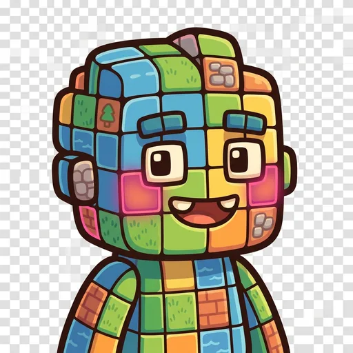
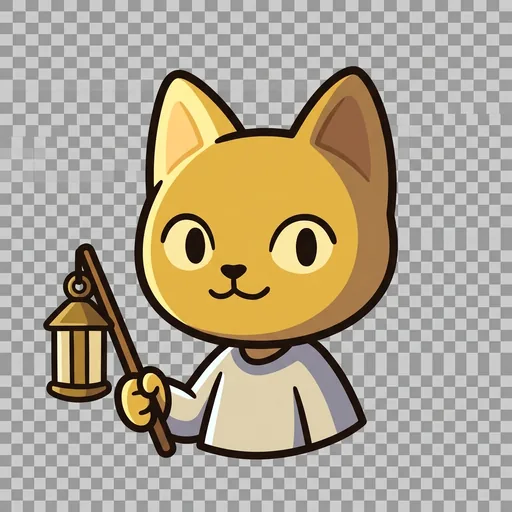
Speck
The single pixel — the atomic unit of pixel art; every image is a grid of these
-
Shade
The palette ramp — a small set of colors arranged from darkest to lightest (the foundation of pixel-art shading and form)
-
Grid
The tilemap grid — pixels snapped to repeating units that form tiles, tilesets, and game maps
-
Tween
The in-between frame — the animation frame that sits between two keyframes, giving motion its smoothness
-
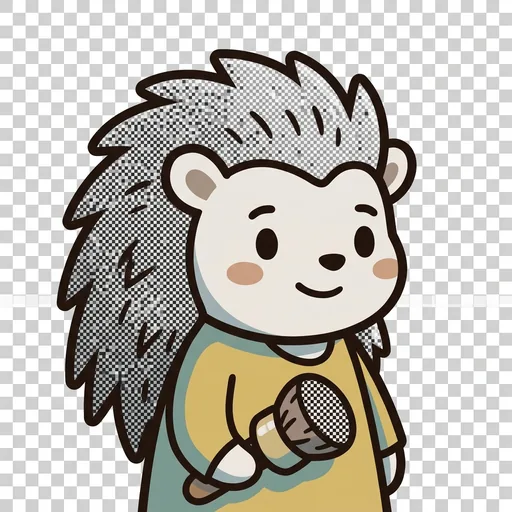
Stipple
Dithering — scattering two colors in a checker pattern so your eye blends them into a third; how pixel artists fake a smooth gradient with a tiny palette
-
Feather
Anti-aliasing — tucking a few in-between pixels along a jagged edge so a curve reads smooth instead of like a staircase
-
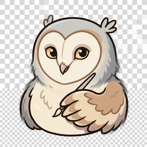
Sheen
Light source and form shading — choosing where the light comes from, then placing highlights and shadows so a flat shape turns round
-
Rim
Selective outlining — drawing the edge only where a sprite would get lost, so it pops from the background without looking boxed-in
-
Cycle
Color-cycling animation — making water and fire flow by shifting which colors sit in the palette slots, without moving a single pixel
-
The Sprite
A finished character sprite coming to life — how placed pixels, a color ramp, chosen light, a clean outline, and smoothed edges layer together into one whole little hero