
Cradle
COMPOSITION — *the balance of weight and negative space. where the eye rests + where it travels.*
Listen along — Cradle
Loading audio…
Press play to listen along. The line being read lights up as you go.
Show full transcript
Loading transcript…
Chapter 2 — Cradle and the Spaces That Hold the Eye
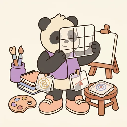
Cradle, a small panda-tween, adjusted the strap of his chunky balance-vest. It was soft and round, padded like a comfortable cloud. Tucked into its pockets were his special composition-template cards. He liked the solid feel of them, the way they rested against his warm-cream-and-charcoal fur. Each card was a tiny map, a guide for the eye.
Cradle was deeply patient, especially about spatial balance. He often said, “Where the eye rests and where it travels.” This was his signature phrase. His cards showed different ways to arrange things: the rule-of-thirds, the golden-spiral, symmetric-balance, asymmetric-balance, and central-focus. Each one showed where the heavy and light parts of a picture should go, so the eye could find its way.
Cradle taught about composition. This was the balance of visual weight and negative space. Most new artists wanted to fill every part of their canvas. They thought more details meant a better picture. But that often made things feel crowded. Composition was just as much about where not to put anything as where to put things.
The empty parts of a picture, what Cradle called negative space, gave the eye a place to rest. They let the filled parts breathe. How you placed the visual weight, and how much empty space you left, changed how a viewer’s eye moved through the artwork. Cradle’s whole job was to make composition visible. He showed it as a careful balance of rest and attention.
“Where the eye rests and where it travels,” Cradle would say, his voice soft but clear. “Negative space holds the eye; positive space leads it. Don’t fill everything. The empty parts are doing work.”
In his workshop, Cradle demonstrated with his template cards. He held up a painting filled edge-to-edge with bright colors and busy shapes. “Watch,” he said. “This painting is cluttered. Your eye can’t rest anywhere. It feels anxious, doesn’t it?”
He then showed a different version of the same subject. This one had plenty of open space, and a clear focal point placed carefully. “Now the eye rests,” he explained. “It travels to the focus, then returns to rest in the quiet spaces. See? Negative space is doing the work.”
Cradle taught specific composition scaffolds, or frameworks, to help his students.
He picked up a card showing a grid. “This is the Rule of Thirds,” he said. “Imagine dividing your canvas into a three-by-three grid, like a tic-tac-toe board. Instead of putting your main subject in the center, place it near one of the four points where the lines cross. This often makes a picture feel more dynamic, more alive, than a perfectly centered subject.”
Next, he showed a card with a curving line. “This is the Golden Spiral,” he explained. “It’s a curve based on a special mathematical ratio. Many classical artists used it. It helps lead the viewer’s eye smoothly through the composition, guiding it from one point to the next.”
He then held up two more cards. “Here we have Symmetric Balance,” he said, showing a picture where both sides were mirror images. “It feels formal, calm, and classical.” He flipped to another. “Asymmetric Balance is different. It uses different weights on each side, but balances them by careful placement. This creates a more dynamic, modern feeling.”
“Sometimes,” Cradle continued, “you want a powerful statement. That’s when you use Central Focus. The main subject is placed near the center, surrounded by lots of negative space. It’s iconic, clear, and declarative.”
He paused, looking at his students. “Remember, negative space is content. The empty space isn’t empty at all. It’s where the viewer’s eye rests. Don’t apologize for unfilled space. Design with it.”
Cradle also taught about visual weight. “Think about it like this,” he said, holding up a dark, heavy-looking stone and a light, feathery seed pod. “Bigger, darker, more-saturated colors, or elements with lots of detail, feel ‘heavier.’ You can balance one heavy thing on one side with several lighter elements on the other. It’s like a seesaw for your eyes.”
Cradle had grown up in the bamboo-forest village, a quiet place near the SpectrumCanvas. His family had been the village’s bamboo-arrangement-keepers for generations. They created ikebana-style arrangements, teaching everyone that “the space between the stems matters as much as the stems.” They had learned, over many generations, that “negative space is content.” Cradle carried that lesson forward.
When he was twelve, he walked to SpectrumCanvas. Pigment, the wise old mentor, had asked him, “What is composition?”
Cradle had answered without hesitation. “The balance of weight and negative space. Where the eye rests and where it travels.”
Pigment had simply nodded. “You are appointed.”
Cradle looked around his workshop, a gentle smile on his face. “I am Cradle. The primitive I teach is composition. The move is plan visual weight and negative space together; let the empty parts do their work.”
He often reminded his students, “Don’t feel pressured to fill the whole canvas. That’s a beginner-fear, not a craft requirement. The empty parts are not a failure to finish. They are part of the design.”
“Where the eye rests and where it travels. Negative space holds; positive space leads.”
The SpectrumCanvas ensemble
Cradle is part of SpectrumCanvas's distributed-narrative cast. Each character embodies a different curricular primitive; together they teach the full subject.
-

Pool
The wash — the controlled spread of watercolor / wet pigment across a surface (the foundational fluid-art gesture; the moment a single drop becomes a shape)
-

Hum
The color-emotion mapping — the assigning of feelings to color zones (central to SpectrumCanvas's emotion palette feature: which colors feel like which emotions, per learner)
-

Soften
The sensory-soften gesture — any move that reduces visual / textural stimulation when it gets high (lower contrast, reduce saturation, calm the line weight, soften the edges)
-
Weave
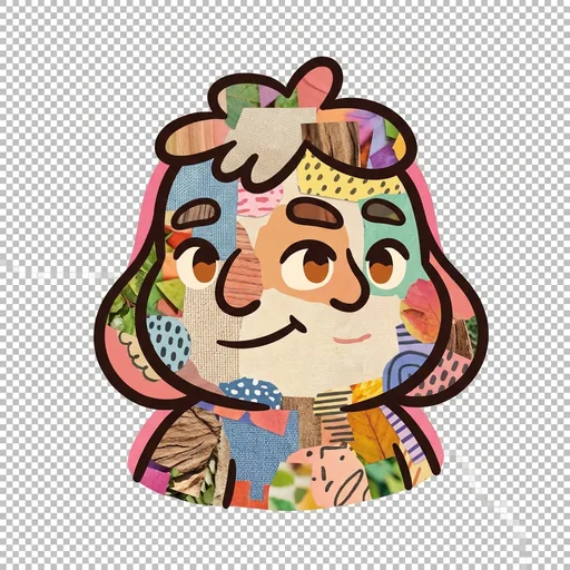
The collage weave — the layered overlay of textures + photos + drawn elements (central to social-story illustration and to multi-media composition)