Hum
COLOR-EMOTION MAPPING — *colors feel like emotions. but WHICH colors feel WHICH emotions is PERSONAL. your map is yours.*
Listen along — Hum
Loading audio…
Press play to listen along. The line being read lights up as you go.
Show full transcript
Loading transcript…
Chapter 3 — Hum and the Map That Is Yours
The blank card sat on the table between Hum and the new student, and it made the student nervous.
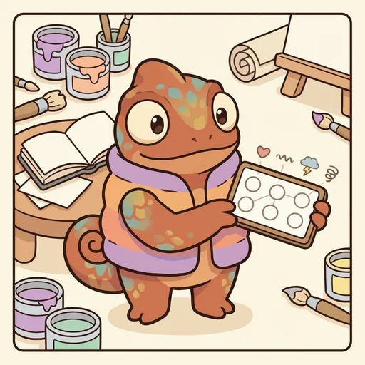
Hum was a small chameleon with soft, rounded scales — nothing spiky about him — and a chunky vest that shifted color as he felt things. Right now it was a gentle gold, because he was curious. The card in front of them had feeling-words down one side: joy, calm, sad, surprised. Beside each word was an empty square, waiting.
“There’s no answer key,” the student said, worried. “How do I know I’m doing it right?”
“Ah.” Hum’s vest warmed to a cozy russet. “That’s the whole thing. Watch.” He picked up a crayon and colored the square next to calm a soft, mossy green. “For me, calm feels like that. Green like the shade under a big tree.” He colored joy a bright sunshine yellow. “And joy feels like that.”
Then he slid the crayons over. “Now you. Not what I picked. What you feel.”
The student hovered, then chose. Sparkly blue for joy. A warm, deep orange for calm.
Hum’s vest glowed, delighted. “See? Your calm is orange. Mine is green. And neither of us is wrong.” He tapped both squares. “The card is a map of what colors feel like to you. It’s your map. Nobody else can fill it in, and nobody else can grade it.”
The student let out a breath they hadn’t known they were holding. The nervous feeling loosened into something lighter.
Hum grew up in a meadow-village of chameleons, where every single one of them wore their feelings on the outside — their scales flushing and shifting with whatever moved inside them.
You’d think that would make everyone easy to read. It didn’t. When his cousin Sable felt homesick, her scales went a bruised violet. When Hum felt homesick, his went pale gray. Same feeling. Two completely different colors.
One day young Hum, sure he’d cracked the code, announced at breakfast, “When you’re happy your scales go pink!” — because his did. His aunt, whose happy-scales ran a deep gold, laughed so warmly it wasn’t unkind.
“Little Hum,” she said, “you just told me how I feel by looking at how you feel. But I’m not you.” She turned her cheek to the light so he could see her gold. “This is my happy. Yours is pink. If you go around telling everyone their happy is pink, you’ll be wrong about almost everybody — and you’ll make them feel unseen.”
That landed in him with a small sting of embarrassment, and then, slowly, with relief. He didn’t have to guess everyone’s insides from his own. He only had to ask. “Everyone’s inside is their own,” his family always said after that. “Don’t expect my colors to match yours.” Hum carried it like a warm stone in his pocket.
When Hum was twelve he walked to SpectrumCanvas, where the old mentor Pigment kept the color studios.
Pigment showed him a painting — a stormy sea done all in reds. “A visitor told me this painting was angry,” Pigment said, watching Hum carefully. “Red means anger, they said. What do you think?”
Hum looked a long time. His vest shifted thoughtful teal. “It might be angry,” he said. “Or it might be a red that means a party, the way red means celebration in some places. Or a red that means missing someone, the way it means mourning in others.” He looked up. “I can’t know the painter’s red by looking with my eyes. I’d have to ask them what red is on their map.”
Pigment’s face softened into a smile. “Most people tell me what the painting must mean. You asked whose red it was.” He set the painting down. “This studio is yours. Teach them to ask.”
Hum felt his heart lift, light and glad, his vest blooming a quiet happy gold — his own gold, nobody else’s.
In his studio, Hum kept a stack of blank maps and a pile of crayons, and he never handed out an answer.
He invited three learners up one afternoon — a boy named Leo, a girl named Maya, and a quiet kid named Ren — and gave each of them a blank map.
“Fill in joy,” Hum said. “Whatever color it truly feels like to you.”
Leo went sparkly blue. Maya went a deep, happy purple. Ren, who sometimes saw colors swim up whenever they heard music, chose a shimmering silver-green that didn’t have a normal name, and looked up quickly to check if that was allowed.
“That’s a real answer,” Hum said gently, before Ren could shrink. “If that’s the color joy is for you, then that’s the color joy is. Your map, your truth.”
Ren’s shoulders came down an inch.
Hum held all three maps in a fan. “Three joys. Three different colors. Three right answers.” Then his voice, still soft, went firm. “So here’s the one rule in my studio, and it’s a rule about not making rules: nobody tells anybody else what a color has to mean. Not you to your friend, not a poster on the wall to you.” He looked at each of them. “If someone says red is anger, that’s just how it is — that’s their map talking. For you, red might be your favorite jacket, or your grandmother’s door, or a party. It’s real and true for you.”
Leo frowned, thinking. “So when I look at Maya’s painting…”
“You remember she painted with her map,” Hum said, pleased. “You don’t scold her purple joy for not being your blue. You just get to meet it.”
Later, when the others had gone, Ren stayed behind, still holding their silver-green map like something precious.
“Nobody ever said my colors were okay before,” Ren said quietly. “People kept telling me I had it wrong.”
Hum’s vest went the tenderest russet he had. He didn’t rush to fix it. He just sat with Ren in the quiet.
“They’re not wrong,” he said at last. “They’re yours. And when something is truly yours, the right feeling isn’t proud, exactly — it’s more like a small door unlocking in your chest. Room to be exactly who you are.”
Ren pressed the map to their front and felt it: that small, warm unlocking, the relief of being seen and not corrected. They breathed out slow, and this time nothing in them was bracing to be told they’d gotten themselves wrong.
The SpectrumCanvas ensemble
Hum is part of SpectrumCanvas's distributed-narrative cast. Each character embodies a different curricular primitive; together they teach the full subject.
-

Pool
The wash — the controlled spread of watercolor / wet pigment across a surface (the foundational fluid-art gesture; the moment a single drop becomes a shape)
-
Cradle
The composition cradle — the balance of weight and negative space on a canvas (where heavy / light elements rest and where the eye can rest)
-
Soften
The sensory-soften gesture — any move that reduces visual / textural stimulation when it gets high (lower contrast, reduce saturation, calm the line weight, soften the edges)
-
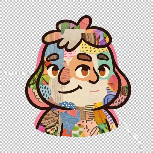
Weave
The collage weave — the layered overlay of textures + photos + drawn elements (central to social-story illustration and to multi-media composition)