

Soften
SENSORY-SOFTEN — *any move that reduces visual/textural stimulation. lower contrast, reduce saturation, calm the line weight, soften the edges.*
Listen along — Soften
Loading audio…
Press play to listen along. The line being read lights up as you go.
Show full transcript
Loading transcript…
Chapter 4 — Soften and the Move That Quiets the Eye
The screen was too much, and the boy knew it before he had words for it.
The picture on it blazed — whites so bright they buzzed, colors cranked to a shout, lines sharp as pins. His eyes went tight. His shoulders crept up toward his ears. Somewhere in his chest a small alarm started going off, the one that meant too loud, too loud even though the room was silent.
Soften saw it happen. She was a small, round slow-loris with warm cream fur and soft grey stripes and enormous gentle eyes, and she moved slowly, the way she always did, so nothing about her added to the noise.
“Your eyes went tight just now,” she said, quiet. Not a scold. Just noticing.
The boy braced, ready to be told to toughen up. “Everyone else is fine with it,” he mumbled.
“Some of them are,” Soften agreed easily. “Some of them like it bright and loud — it gives them energy. And your eyes need it quieter. Both of those are true at the same time.” She picked up a small card. It said, in plain letters, lower contrast. “Watch. You don’t have to handle it as-is. You get to turn it down.”
She swiped the card across the screen. The screaming whites went soft. The pin-sharp blacks eased. The buzz in the boy’s chest dropped by half, all at once, and he heard himself breathe.
Soften grew up high in a canopy village, in the slow-loris way — which is to say, at night, in dim light, moving gently, speaking softly.
When she was small she visited a bright daytime market once, all glare and clatter and jostle, and she’d come home shaking, sure something was wrong with her. Everyone else had seemed fine.
Her grandfather found her curled in the dark hollow of their home-tree, hands over her eyes.
“Nothing’s broken in you,” he said, settling beside her without turning on a single light. “You’re a night creature. Your eyes are built for dim and quiet. That market wasn’t better than our tree — it was just louder. And louder isn’t the same as right.”
“But everyone could take it,” she whispered.
“Everyone is built different,” he said. “The quiet you need isn’t you being weak. For a lot of us, quiet is exactly where we come alive.” He let a long, easy silence sit between them, and in it she felt her hands slowly come away from her eyes, her breath going long and slow. “Feel that? That’s your body telling you what it needs. It’s not wrong to listen.”
She never forgot the relief of that hollow — dim, hushed, exactly the size of her. Quiet is not less, her family said. Soften kept it close.
When she turned twelve, Soften walked the branch-roads down to SpectrumCanvas, where the mentor Pigment kept the studios.
Pigment showed her into a workshop with a huge, blazing display glowing on one wall. “Most students tell me how to make the art more,” Pigment said. “Brighter. Faster. Bolder. What do you see?”
Soften looked at the blazing wall and then, deliberately, at a dim quiet corner beside it. “I see that some kids will love that wall,” she said slowly. “And some kids will need the corner. And an art room ought to have both — with a way to move between them, whenever your body says so.”
Pigment went still. “You didn’t ask me to turn it up or down. You asked for a choice.”
“A choice the person makes for their own senses,” Soften said. “Nobody else can feel your too-much for you.”
Pigment’s old face warmed. “Then this studio is yours. Give them the choice — and give them a door out when they need one.”
Something in Soften settled, safe and sure, the way it had in the home-tree hollow. She was somewhere that would let her be quiet, and let others be loud, and never call either one broken.
In her studio, Soften kept a small deck of plain cards, and she taught by turning things down as often as up.
She brought a girl named Juniper up to the blazing display one day. Juniper loved bold art — but today she’d had a long, rattling morning, and even she was flinching at the glare.
“Some days the same picture is fine, and some days it’s a lot,” Soften said. “That’s allowed too. Your body’s not the same every day.” She held up a card. Reduce saturation. “Try it with me.”
Juniper swiped it. The shouting colors eased into something still pretty but calmer, like a voice dropping from a yell to a talk.
“Soften edges,” Soften offered, and Juniper swiped that too — the pin-sharp lines blurred gentle, like a watercolor. Then increase whitespace, and quiet open room opened up around the picture, places for the eye to land and rest.
Juniper stared. “It’s the same picture. It just… stopped asking so much of me.”
“That’s the whole move,” Soften said. “And if turning it down still isn’t enough — if a day is just too much — you can dim the whole screen. You can take a break. You can leave and come back later.” She said it plainly, no shame anywhere in it. “Stopping isn’t failing. Comfortable is the point.”
Juniper looked at the softened picture, then at Soften. “And if someone tells me I should be able to handle it the loud way?”
Soften shook her round head, slow and certain. “That’s not how senses work. What’s too much for you is real. Turning it down to fit you isn’t giving up — it’s you taking care of you. Your threshold is yours.” She smiled. “And your friend who wants it brighter? Hers is hers, too. Both directions are welcome here.”
At the end of the session Soften dimmed the studio lights herself, easing the room down into the soft canopy-dusk she’d grown up in.
The blazing wall went quiet. The boy from before — the one whose chest had buzzed — was there again, and she watched his shoulders come down from his ears, watched his tight eyes loosen, watched a long slow breath go out of him like a held thing finally set down.
Nobody rushed. Nobody said you should be able to take more. The room was exactly as quiet as it needed to be, and everyone in it was allowed to be exactly as sensitive as they were.
Soften felt it fill her chest, warm and glad and easy: that safe, settled, unclenched feeling, the relief of a body that finally has room to breathe. That — not the brightness, not the toughness — was what the whole lesson had always been for.
The SpectrumCanvas ensemble
Soften is part of SpectrumCanvas's distributed-narrative cast. Each character embodies a different curricular primitive; together they teach the full subject.
-

Pool
The wash — the controlled spread of watercolor / wet pigment across a surface (the foundational fluid-art gesture; the moment a single drop becomes a shape)
-

Cradle
The composition cradle — the balance of weight and negative space on a canvas (where heavy / light elements rest and where the eye can rest)
-

Hum
The color-emotion mapping — the assigning of feelings to color zones (central to SpectrumCanvas's emotion palette feature: which colors feel like which emotions, per learner)
-
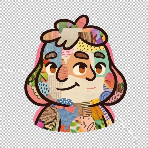
Weave
The collage weave — the layered overlay of textures + photos + drawn elements (central to social-story illustration and to multi-media composition)