

Graph
DATA VISUALIZATION — *shape-of-the-story posture* (which chart tells the truth, not the loudest one). The data-pipeline primitive of *choosing the chart that fits the data, not the chart that looks impressive.*
Listen along — Graph
Loading audio…
Press play to listen along. The line being read lights up as you go.
Show full transcript
Loading transcript…
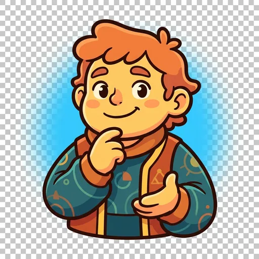
Chapter 3 — Graph and the Chart-Pencil Set
The chart on the wall of the school fair was gorgeous, and Graph could tell in three seconds that it was lying.
She was a finch, small and bright-eyed, with yellow feathers mixed with cream and russet. A little leather case of chart-pencils sat tucked in her vest. She stopped in front of the winning entry: a tall, glossy, three-dimensional bar chart, tilted at an angle, rainbow-colored, that seemed to shout our club grew HUGE this year!
She leaned in and read the tiny numbers along the side. Then she frowned.
“The bottom of this chart doesn’t start at zero,” she said to the boy standing proudly beside it. “It starts at ninety. So the club going from ninety-two members to ninety-five looks like it tripled.” She tilted her head at the 3D tilt. “And the slant makes the front bars look even bigger. Three new members. That’s the whole story. The chart’s making it look like a hundred.”
The boy’s face fell. “But it looks amazing.”
“It does,” Graph agreed. She wasn’t unkind about it. “That’s the trouble. A chart isn’t just a picture — it’s saying something to whoever looks at it. This one’s saying something that isn’t true.” She took out her pencils. “Want to make one that looks a little plainer and tells the truth? I’ll help.”
Something in her settled as she said it — the quiet, sure feeling of picking honesty over flash.
Graph learned that colors and shapes carry meaning long before she learned about charts.
Her family were the quilt-makers of a small village, finches who designed the yearly harvest-quilt. Each square showed what a family had given to the shared stores that year — grain, wool, apples — and the colors were chosen to honor what was true.
When Graph was six, she wanted to make her square with every color in the basket, all at once, because it would be the prettiest. Her grandmother gently stopped her hand.
“A square that’s all rainbow says nothing,” her grandmother said. “Nobody reading the quilt will know what your family gave.” She laid out three careful colors instead — gold for grain, gray for wool, red for apples. “A quilt with meaningful colors becomes a treasure the whole village trusts. A quilt with random flashy ones is just noise on a blanket.”
Graph looked at the two versions — her rainbow scribble and her grandmother’s honest three colors. The plain one told a true story. The pretty one told nothing.
“So the prettiest isn’t the best,” she said.
“The truest is the best,” her grandmother said. “If you can make the truest one lovely too, that’s the real skill. But truth comes first. Then beauty.”
When she was grown, Graph walked to the DataForge academy with her chart-pencil case in her vest.
Datum, who ran the academy, met her at the door. “Show me how you’d tell a story from numbers,” Datum said.
Graph didn’t recite a list. She pulled out a folded card — bar, line, scatter, pie, histogram, box-plot, heatmap, map — and set it beside a small pile of numbers on the workbench.
“First I look at the shape of what’s here,” she said. “Is it groups I’m comparing? Then a bar. Is it a thing changing over time? A line. Two things that rise and fall together? A scatter.” She tapped the card. “The data has a shape, and the shape tells you which chart is honest. I never pick the flashiest one. I pick the one that fits — and then I make that one as clear as I can.”
Datum studied the card and the numbers. “And when the pretty choice and the honest choice pull apart?”
“Honest wins,” Graph said simply. “Every time.”
Datum nodded and stepped aside. “Then come in and teach them that.”
In Graph’s workshop, a girl named Sorrel brought her a pie chart she’d made of how her class spent recess. It had eleven thin, colorful slices, and it was very hard to read.
“It’s so colorful,” Sorrel said, a little unsure, “but nobody can tell what it means.”
“Let’s find the shape of your story,” Graph said kindly. “What are you actually showing?”
“How many kids do each recess thing. Soccer, reading, swings, tag…”
“Are those parts of one whole that add up to everyone?”
“Sort of. But some kids do two things.”
Graph smiled. “Then it’s not really a pie — pie charts only tell the truth when the slices add up to exactly one whole, once each.” She turned Sorrel’s chart over to the blank side. “You’ve got groups you’re comparing — soccer kids, reading kids, swing kids. What shape is that?”
Sorrel checked the folded card. ”…Bars?”
“Bars,” Graph agreed. “One bar per activity, all starting at zero, tallest to shortest. Suddenly anyone can see it in a heartbeat.” She handed Sorrel a pencil. “And label everything — what each side means, where the numbers came from, how many kids you counted. A good chart tells the reader everything they need, and hides nothing.”
Sorrel drew the bars. The messy rainbow pie became a clean, plain, readable thing — and for the first time you could actually see the answer.
Sorrel looked at her two charts side by side: the flashy one, and the plain honest one. “The first was prettier,” she said, a little wistful.
“It was,” Graph said. “I still make pretty-but-wrong ones sometimes. That’s how I learn — the moment the flashy thing and the honest thing pull apart, I choose honest and start over. It’s just practice.” She tapped the clean bar chart. “This one’s beautiful in a different way. It’s beautiful because it’s true. Nobody looking at it will be fooled.”
Then she closed her chart-pencil case, and a warm, steady gladness settled in her chest — the good feeling of having shown the truth plainly. The next pile of numbers waited, and Graph felt calm and quietly happy, unworried, ready to be honest all over again.
The DataForge ensemble
Graph is part of DataForge's distributed-narrative cast. Each character embodies a different curricular primitive; together they teach the full subject.
-

Catch
Data collection — who-what-why-when posture (every dataset has a collector + purpose + omissions)
-

Tidy
Data cleaning — preparation-with-integrity posture (every cleaning choice changes meaning; document the choices)
-
Tell
Interpretation — correlation-not-causation posture (data shows patterns; humans interpret; confidence not certainty)
-

Guard
Data ethics — bias-privacy-harm-consent posture (who benefits, who's harmed, who decided; structurally present in every kit from kit 6)